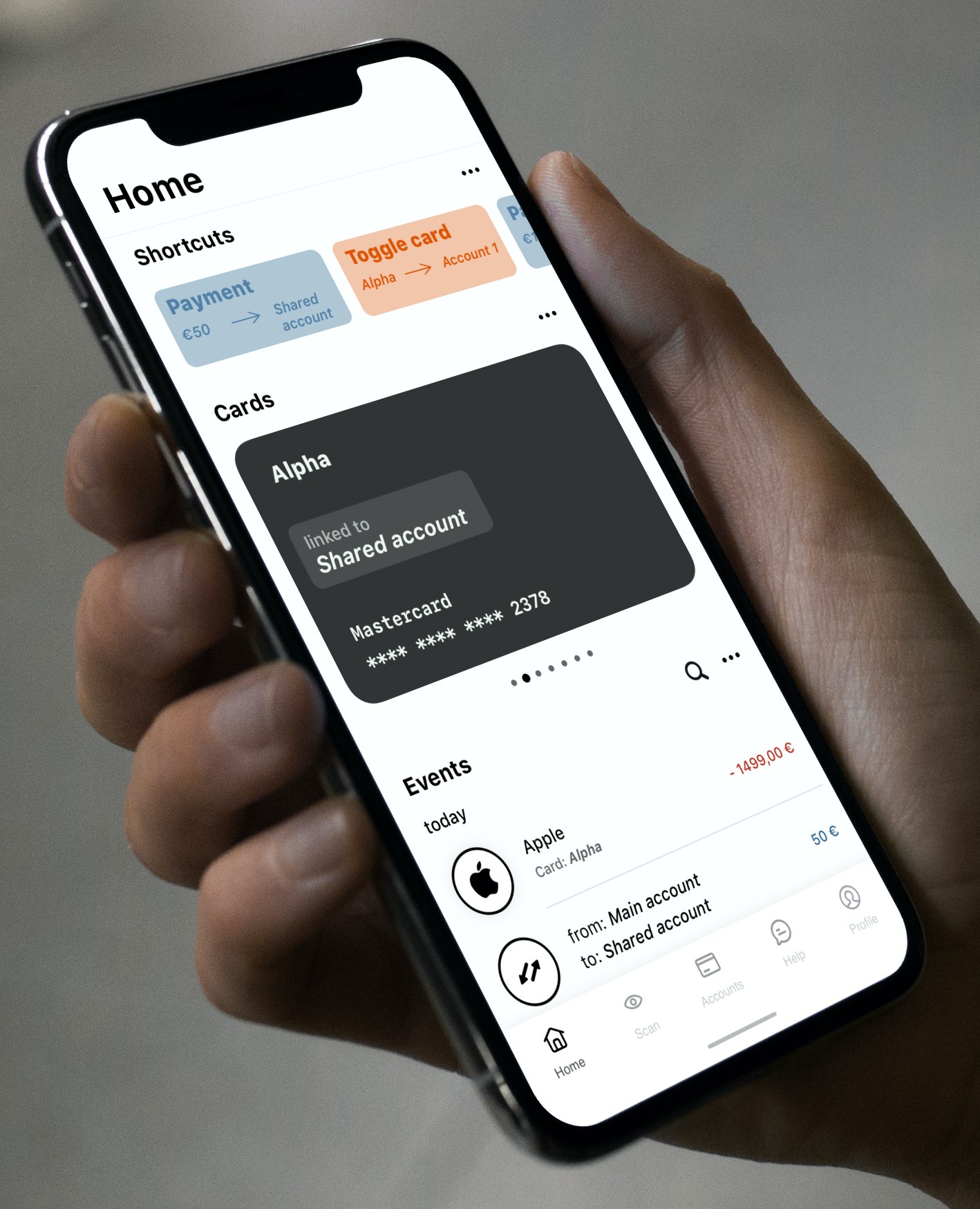
I did a quick mockup of what I think the homescreen should look like. I'm not saying this should be exactly it, but functionality-wise you want a home screen where most of the information you need most of the time is present. 'Cards' don't necessarily need a separate tab-bar icon, but 'Accounts' do. The 'Accounts' screen should have specific controls for payment and request and insights. The current V3 has to much going on in one area of the app.
Shortcuts
Quickly toggle a card between two accounts. Quickly do an often made payment.
Cards
You don't have to see all the cards at once. It is too convoluted and your brain can't process it easily. Also, you want to see all relevant data about a card in one glance.
Events
This would be the 'global' feed of transactions. Enable specific accounts with the 'more options' button. Search quickly through all transactions. Transactions between user owned accounts show up as one event.
Any thoughts are welcome.

 RonRookie