 JohannesChamp
@Sebastian-Aquamarine-Penguin#177617 Same here. I have really promoted bunq. Not anymore.
JohannesChamp@Sebastian-Aquamarine-Penguin#177617 Same here. I have really promoted bunq. Not anymore.
 GastonAce
An feature I would REALLY love is to add external credit cards, e.g. AmEx to see balance and transactions.
For V3;
❤️ Light mode
❤️ Disable the counters for trees and savings (setting)
❤️ full transaction overview (independent of account)
❤️ Option to disable, hide or replace US
And:
🌈🌈 Create your own menu 🌈🌈
My stock broker has this: I can determine myself what i want the bottom menu buttons to be
 CasperWizard
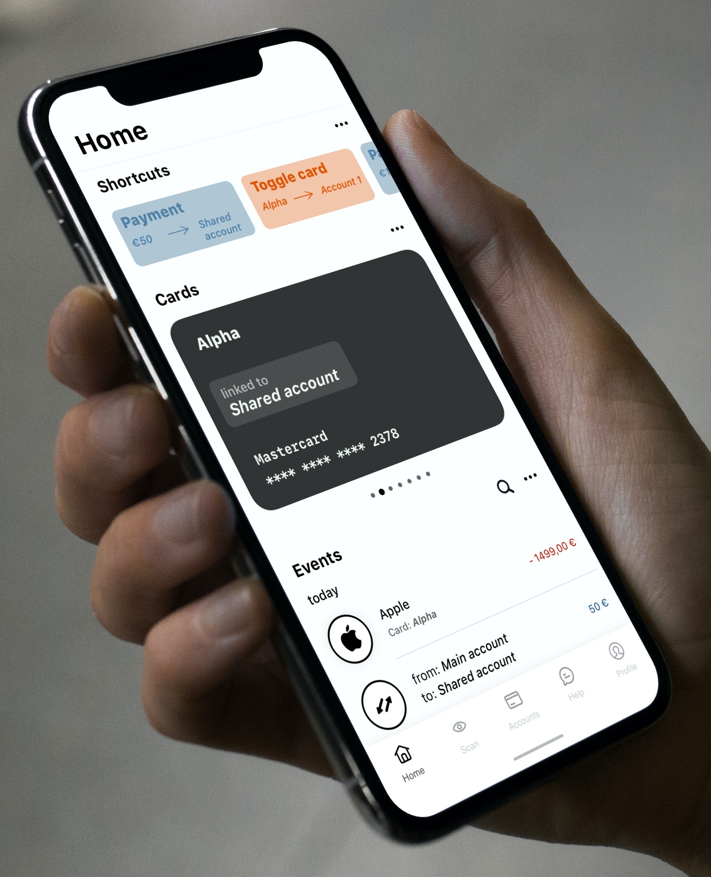
I did a quick mockup of what I think the homescreen should look like. I'm not saying this should be exactly it, but functionality-wise you want a home screen where most of the information you need most of the time is present. 'Cards' don't necessarily need a separate tab-bar icon, but 'Accounts' do. The 'Accounts' screen should have specific controls for payment and request and insights. The current V3 has to much going on in one area of the app.
Quickly toggle a card between two accounts. Quickly do an often made payment.
You don't have to see all the cards at once. It is too convoluted and your brain can't process it easily. Also, you want to see all relevant data about a card in one glance.
This would be the 'global' feed of transactions. Enable specific accounts with the 'more options' button. Search quickly through all transactions. Transactions between user owned accounts show up as one event.
Any thoughts are welcome.

GastonAce@Casper-Yellow-Wolf#177629 Bunq hire this guy
 KasperChamp
@Casper-Yellow-Wolf#177629 Je noemt dit een snelle mockup, Bunq nam maanden tijd voor V3. Ik hoop dat Bunq hier serieus naar zal kijken, want het is echt een super ontwerp!
 LianneChamp
@Casper-Yellow-Wolf#177629 Ik wil dit!
 Esther 💎Wizard
@Casper-Yellow-Wolf#177629 🤩, great! I like your design very much.
 NickAce
Looks nice, but may not work for everyone. I then prefer to see a customizable Me page where everyone could decide which info they want to show where, all within the possibilities of the technique of course.
 ArjanAce
Ik zou ook een voorkeur hebben om te zien wat er ge-update wordt in de versie. Zo kan je zien wat er verbeterd wordt, maar ook zien of er door de update een bug is ontstaan. Bijna elke app doet dit en het lijkt mij ook bij deze app te horen.
 GabrielAce
@Casper-Yellow-Wolf#177629 If bunq had ACTUALLY listed to their customers (us) instead of the guy who sees himself as the customer (Ali)
 Wouter🇳🇱Ace
@Gaston#177628 🌈Maak je eigen menu!🌈
Customization = key @bunq.
Ik begreep dat V3 onder de motorkap veel krachtiger is dan V2 voor de volgende stappen. Dan is dit wellicht een peuleschilletje...
GastonAcehttps://imgur.com/gallery/Kgjrbjg
This is what I meant by configurable menu bar
 SteveRookie
I used to love everything about Bunq, including and especially the beautiful simple design (UX) and striking attractive interface (UI).
This new V3 is terrible. Man, what a quantum leap backwards! Things are hard to find, it's ugly as sin, dark mode is hard to read in bright conditions, important features are missing and has irrelevant marketing nonsense (CO2 saved) in prominent interface positions. I literally had to increase the brightness on my phone just to read things in this new dark mode.
Can I revert to the old app, please? I really loved it.
Can't see myself sticking with Bunq if this is the app going forward. I have Revolut, TransferWise and N26 accounts too but have been using Bunq as my main account (rent and salary). Sad to see an awesome brand lose the plot in such a big way 😥
 JakobRookie
Wow! Thread got deleted to keep Togehter 'clean'...
Okay, so there are many things that I don't like about v3, but I will pick only one to discuss in more detail.
In English, 'saved money' has different meanings,
- It can be money that I have put aside for future spending.
- It can be money that you didn't need to spend, for instance because of a discount.
In 'Money saved' it seems that those two types of savings are just added up. To me, it doesn't make any sense and it makes me wonder what the intended function of 'Money saved' is.
- is it to show the benefits of a Bunq subscription? If so, it makes not sense to add money which I have put aside. I can do that with any savings account. Anyway, such number would make sense if it gives a complete picture (please deduct higher than average subscription fees). But really, we all already knew the benefits. That's why we decided to switch to Bunq
- is it to give me a compliment on how much money I saved for future spending? Thanks, that's really nice of you and could in fact be useful!
In dutch, these two different types of saved are reflected by the words "bespaard", which is used in the overview, and "gespaard", which is used in the detailed view.
So, please make up your mind on what is the function that you intended and the added value for the user. If you don't know, better leave it out.
Same as above with 'Time saved'.
You can't add up thoughput time (opening addional account) and minutes for time processing an invoice.
That's just adding apples to pears.
Plus: paint a complete picture if you really want to show saved time.
Deduct the time we have to spend on giving you feedback on a failed product.
Deduct a second for each time I have to look at these useless numbers when I open the app.
Deduct the extra time I have to spend on finding the functions that I need.
SteveRookie@Tristan-Grey-Tiger#173047 I'm voting with my wallet too. Bunq has taken a wrong turn here and I'll be switching and closing my account if no reversion to V2 is made available.
This thing is so bad that it can't be fixed; it can only be rolled back. Sad to see a team that got so many things right suddenly drive the Bunq bus over the cliff. I mean it's so so soooooo bad, how could this have happened!?
 ElioChamp
I am done waiting and hoping for a response from bunq. It has been 5 days since the release and in no way we get any response to the thousands of complaints about the new V3 application. I am voting with my feet now by running to another bank. I always was super enthusiastic about bunq (green card founder) and even persuaded others to join bunq as well, but the new update plus the complete silence and the arrogance of Ali stating: ”they just have to get used to it” instead of listening to the users, made me leave. Good luck planting trees and promoting your instagram, I’ll make an impact elsewhere.
 MarijeRookie
@Elio#177825 Same for me, and by what I see, a lot of other people too. The sheer arrogance, poor communication as well as downright ignoring of customer feedback has made me lose all trust in this bank and I no longer feel comfortable handling my money in my bunq accounts, so I’m taking my money elsewhere. The fact that I will probably have to go to a bank with less possibilities than bunq can offer, is a loss I’m willing to take over my discomfort with bunq being tone deaf and unwilling to admit any wrongdoing.
I firmly believe that it’s ok to make a mistake every now and then, and people as well as companies can come back from that. But this is a prime example of how to NOT handle a mistake.
 LauraineAce
 Renze NicolaiRookie
Revert to v2, that's how to make v3 better.
 SalesdockRookie
Wat een drama update dir v3, ongelofelijk.