• Exploring the amazing bunq V3? Let us know how we can make it even better!

tl;dr Please bring back V2 🙏

I'm missing
- Light mode
- The simple list with custom icons for each account
- Hide / show account balances directly above the list
- The "Events" tab

I don't want
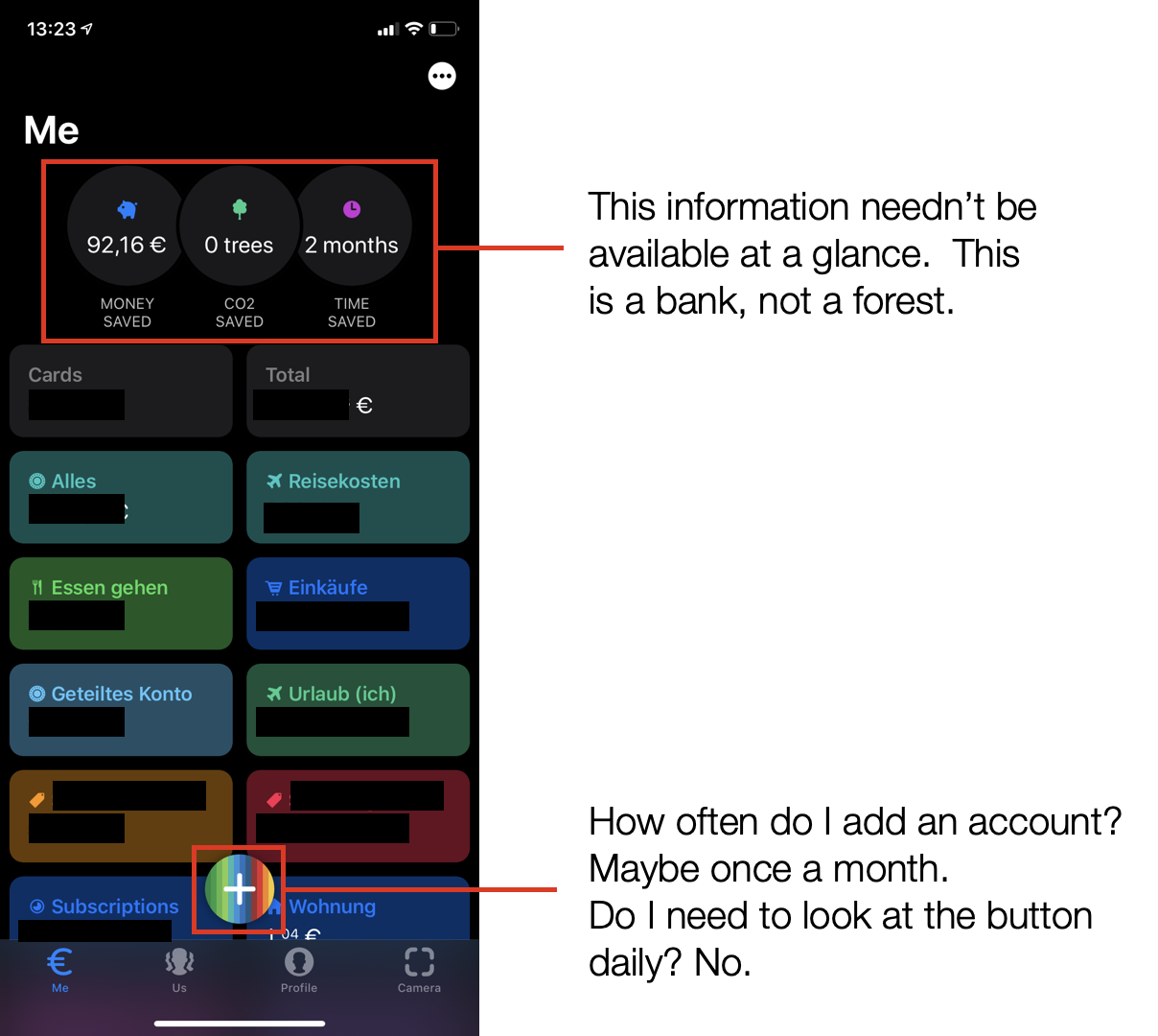
- The useless "Us" tab
- The big "+" button
(Both is just a cheap try to increase "engagement" / sell stuff.)

Now, I'm forced to use bunq via the API in my multi-banking App. So what you get is less "engagement" and I'm planning to cancel my account.

Bunq is selling itself as an community oriented bank while ignoring all the feedback for V3 🤷‍♂️.

    @Asitis#172940 Someone on here posted a how to but I think @bunq censored it. I’m not on Android so not sure on the process... sorry I can’t be more help. Maybe something on r/bunq?

      @Gabriel-Green-Tiger#170823 OMG I didnt even realize that the contents of the + button change based on the page you're on. I literally can't use this app anymore. What a terrible update and even worse onboarding.

      I have 8 accounts and the bottom two don't even show the balance anymore, the app doesn't scroll far enough.. Besides that literally everything has been said. In the end I'm glad I never fully swapped to Bunq. I hope you listen Bunq, at least bring V2 back for us while this is sorted. I can't use this as my banking app, it's not social media, it's one of the most important things in daily life. Without a rollback I'll definitely close my account by the end of the month.

        It is bad.. really really bad. Can't even begin to name what is worse.. the US section... the + button. The overview of accounts... the complete APP is utterly bad.

        I have 4 accounts as a pack user and since the tree update in V2 you guys have the focus utterly wrong. Please, please get your shit together because this update makes me wanna change bank accounts asap!! It is soooo wrong in sooo many ways. Unbelievable.

        And i'm a really really big fan! even have stickers on my car.... not sure for how long anymore.

          Giving a week for the previous version to be rolled back, otherwise cancelling my account.

            I have turned automatic updates for bunq off, as long it is nog necessary to update I will use the amazing Bunq V2. I do not want this crap, I will wait until all the bugs are fixed. Please let the pictures come back :(

              Wie kann man den eine Karte sperren?

                @Tjarko#172965 I have stickers on my bike! I was such a fan boy, I’m holding out hope that @bunq or more specifically @ali will listen to the community and work towards restoring the bank to its previous glory.

                  Uh oh the us tab now shows a picture with a link embedded to instagram... thought those are links to blog posts but here we are.

                  A banking app which links to external sites without notice.... great stuff

                    Can we have a button to switch back to the old UI? This just doesn’t work for some of us.

                      The overal design and interface is a mess. Crucial functions are hidden away behind unclear buttons or behind countless menus (nfc payments), and instead the app is cluttered with Bunq's own marketing. They clearly prioritise their own business before the users.. I don't see how V3 can be an improvement without going back to the drawing board and redesign almost every single aspect.

                        @Samih-Teal-Kiwi#172986 Yes, @bunq - please allow us to revert back to the old app. And make this update voluntary.

                          @Diego-Indigo-Ar#170801 Je ne retrouve plus mon compte pro😤

                            Bitte kümmert euch um folgende Dinge, damit bunq mir wieder Spaß macht:

                            1. Gebt uns die alte Menüführung zurück und verbessert diese. Durch das Update brauche ich viel zu viele extra Schritte. (Kontostand verbergen, Grafik zum Konto anzeigen, ...)

                            2. Entfernt die Infografiken vom Hauptbildschirm. Mich interessiert nicht, wie viel Zeit und Geld ich theoretisch gespart habe. Klopft euch bitte woanders auf die Schulter.

                            3. Der groß implementierte Werbe- und Infofeed unter „Von uns“ interessiert mich nicht und braucht für meinen Geschmack nicht so eine prominente Platzierung in der App. Sich für Projekte einzusetzen finde ich gut, aber es ist und bleibt eine Banking App und dafür möchte ich sie primär nutzen und keine, für mich unnötigen Informationen, erhalten.

                              I cannot see/manage (some) joint accounts anymore. The most basic functionality of banking! This is quite unacceptable, especially since there is no way of going back to the old version that actually lets me do banking.

                              Other than that I agree with most people in this thread, no need to clutter the app with marketing for bunq, I am already paying for my subscription!
                              - Give us the option to hide the "US" section (a.k.a. the bunq Instagram feed), we use bunq for banking, not social media
                              - Give us the option to hide the money/co2/time saved buttons, we use bunq for banking, not planting trees

                                Happy I'm still on V2. Hopefully it will take a while before updating to V3 is required. I need some time to move somewhere else.


                                  I seldom write a complaint anywhere, normally choosing to vote with my wallet. But not today. Your new UI is such a disaster and forcing it upon so many previously happy customers is a tragedy. Not only is it ugly (subjective, but no light mode, are you kidding?) but it's terrible from a UX perspective (non subjective).

                                  I'm giving you two months to fix this (all of it, not gradually), or I'll switch to one of your competitors. Let this be a lesson to your overly enthusiastic and overly excited UI/UX Team to take it easy and gather some REAL customer feedback before releasing such a travesty into the wild. Also, since bunq is a startup priding itself with moving fast, move fast now too - just backwards.

                                  And to whoever thinks this "isn't that bad", it is. This is Apple Maps bad.
                                  If you think this UI can be "improved gradually" to fix "minor issues", you're in for a surprise: it can't, roll it back. And maybe take consequences - even the might Apple did, and you're no Apple.

                                    @bunq#170787

                                    • Zeer teleurgesteld met de update, Plaatjes weg zoals me profile picture.

                                    Automatisch labelen van me transacties (sort) is ook zinsloos omdat er weinig groepen zijn en daardoor veel in dezelfde groep vallen.
                                    - Doe dit zelf met dubbel pin en verschillende rekeningen, maar daar kan ik op me profile geen piechart en opsomming van krijgen ?!
                                    𝗔𝗹𝗹𝗲𝗲𝗻 𝗗𝘂𝗯𝗯𝗲𝗹 𝗣𝗶𝗻 𝗶𝘀 𝗩𝗲𝗿𝗱𝘄𝗲𝗻𝗲𝗻 𝗱𝘂𝘀 𝗱𝗮𝘁 𝗸𝗮𝗻 𝗶𝗸 𝗼𝗼𝗸 𝗻𝗶𝗲𝘁 𝗺𝗲𝗲𝗿 𝗱𝗼𝗲𝗻 :( !

                                    • Online kaart niet meer individueel per vak te kopieren, Hierdoor verlies ik enorm veel tijd.
                                      𝐃𝐢𝐭 𝐰𝐨𝐫𝐝 𝐧𝐢𝐞𝐭 𝐚𝐟𝐠𝐞𝐭𝐫𝐨𝐤𝐤𝐞𝐧 𝐯𝐚𝐧 𝐭𝐢𝐣𝐝 𝐛𝐞𝐬𝐩𝐚𝐚𝐫𝐝 𝐝𝐚𝐭 𝐯𝐚𝐥𝐭 𝐦𝐞 𝐞𝐧𝐨𝐫𝐦 𝐨𝐩 !

                                    • Bovenste deel van me scherm gevuld met onzin, zoals geld bespaard, tijd bespaard en bomen gered. Hieraan hoef ik niet aan herrinnerd te worden en zorgt ervoor dat ik niet voor de greencard ben gegaan, net als de US page

                                    • Teksten raar en anders / verkeerde vertalingen

                                    • wanneer in subrekening niet gelijk de voorspellingsgrafiek maar daar moet je apart op drukken !

                                      I just had my first “in real life” experience.

                                      While shopping I sometimes switch to another bankaccount for payments, normally just a push on a button and the card was attached to the other account.

                                      Just try to find this “now hidden feature” yourself. Such a bad UX!!!